Taking the Gallery Public
John Haberin New York City
Jean Dubuffet, Bosco Sodi, and Liam Gillick
As galleries reopened in a pandemic, a question hung in the air. Not just when were they coming back, but what had they become? Is this all there is? For artists and dealers struggling to survive, will it be enough? I might ask instead what they were all along.
Are they retail establishments, bringing a luxury good to collectors and support to the artists who feed them? Or are they public spaces, like parks, street corners, and even museums—where you and I can be alone among strangers and with the art?
If the first seems overly high toned or worse, the second may seem overly hopeful, but Jean Dubuffet was always the optimist. He conceived Le Cirque as an urban plaza within the space of the gallery, at Pace in 1970. 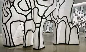 Together with a second sculpture, meant for people and the great outdoors, it has never looked more open and more relevant. Bosco Sodi, in turn, treats his gallery like the earth itself or a chapel. If art as a chapel recalls Mark Rothko, Minimalism after him stressed all along the shared space of the viewer and the work. Liam Gillick riffs on Donald Judd's design sense with his own questions for today.
An indoor urban plaza
Art after Covid-19 has proposed a third model, neither luxury establishment nor public plaza—and it, too, was implicit all along. Is art public entertainment, like sports and the movies? Elected officials, most of whom have probably never set foot in a gallery, seem caught somewhere between the models, and so for now are visitors. Gallery reopenings came hesitantly, before arenas and theaters, but well after stores and with all sorts of restrictions. Pace itself requires appointments. Jean Dubuffet, I like to think, would be appalled.
He did call the work a circus, but where are the performers, other than you? An urban plaza without traffic seems an imperfect analogy, too, but then the work is always open to other meanings, all again reminiscent of public spaces. One can imagine Le Cirque as trees, statues, or a poor person's Stonehenge, in a rough circle at Pace's Chelsea gallery, leaving the first half of seven floors empty. It is massive but open, broken by arches, their edges outlined in black. Further black curves cross the white surfaces like doodling. Dubuffet then was also caught up in his Hourloupes—large paintings with the same motif but touched with red and blue.
One can see why he took to doodling. He had championed Art Brut, even without knowing Art Brut photography or a Czech artist, Anna Zemánková, to capture the savagery of outsider art but also its inner child. The paintings all but omit the savagery, although they derive from the French for wolves, and they have become the movement's quasi-official museum face. Still, Dubuffet was already moving to sculpture, with his abstract Simulacres—"simulations," if you like, that simulate nothing or "apparitions" that weigh upon the ground. Now he proposed something bigger in a long letter to Pace's founder, Arne Glimcher, almost illegible from his handwritten corrections. He is thinking impulsively to the point of doodling.
He gains considerably from the mass. You can see it from a distance and then get close to make it your own. You can appreciate its scale and its gaps alike. They look open visually but would take some bending down to use as gateways, and the guard, I suspect, would not be happy. That still leaves the question of whether art can have the character of a public square. Can it transform the gallery into one as well?
A second work, Jardin d'émail, makes the possibilities explicit. It takes the very shape of a clearing in the woods or an office plaza, and Dubuffet had both in mind at the time. It presents a raised platform as a fictitious landscape, with a hilly surface and a tree for shade. A photograph imagines it amid an actual dark wood, with people taking their ease. I doubt that he ever got to build it, but he did design a similar work for out front of a bank in Lower Manhattan. Here one has to settle for a mock-up, large enough for strollers but definitely off-limits.
Marianne Moore described poetry as "imaginary gardens with real toads in them." Dubuffet offers a real garden with imaginary toads and trees. In French émail is enamel but also luster, and it takes its brilliance less from the matte white than the conception. Artists ever since have treated galleries as public spaces for perilous performance art, like Chris Burden or Terence Koh at risk from crawling across floor. The Frenchman was there first, without the peril, and for now that may be just what is needed. Unlike the real world, he will never ask you for your contact information or take your temperature.
The anti-Rothko Chapel
Bosco Sodi treats his gallery as the anti-Rothko Chapel. Partitions from the last show, of William Copley, are gone, for an undivided tribute to art, light, and space. As with Mark Rothko, the long central aisle of a great cathedral pares back to room for reflection on just one or two large paintings to a wall. As in Houston, too, Sodi identifies the paintings with the wall—only not in dark shades of gray, but in white. He could be sending a challenge to Rothko at that. He makes each of those paintings nearly nine by twelve feet.
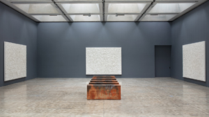 Not that this chapel faces east like a cathedral, and it benefits from its windowed entrance on a Chelsea side street with southern light. By his own account, though, Sodi is looking not south to Houston but east to Spain. He takes each work's precise dimensions from three paintings at the Miró foundation in Barcelona, where he used to live. He spent hours there alone, in preparation for the series now. Joan Miró, too, worked in solitude and in white, with Peinture sur Fond Blanc pour la Cellule d'un Solitaire ("painting on a white background for the cell of a recluse"). In his darker way, Rothko would have understood.
The show's French title, "Vers l'Espagne," situates it in a context of French Modernism and Surrealism as well, much as with Miró. Sodi, though, doubles down on the reference to Spanish art. He works thick, and cracks in the monochrome are the composition, much as for Antoni Tàpies half a century ago. Where Tàpies mixed his oil on canvas with burlap and sand, Sodi combines clay, sawdust, and pigment. Its sheer thickness and identity with the walls also bows to cave painting. Paris, New York, and Houston may have a history when it comes to modern art, but they have nothing, it seems, on Spain.
Actually, the most celebrated cave paintings are at Lascaux in southwest France or Tassili n'Ajjer in Algeria, but why quibble? This work lacks for those marvelous cave horses, but it is as full of action as "action painting" in its own austere way. It also surrenders to the elements, in both process and imagery. Sodi lays things on, and the cracks develop where they may. So do channels as the materials flow. Like Sam Falls elsewhere in Chelsea, he trusts to gravity and to chance.
Three paintings in a room off to the side, not quite as large, incorporate purple and blue, to underscore the parallels to water and erosion. Still, these are dry gulches, like the arid earth of Sodi's native Mexico. What look at first like rusted metal pews in his cathedral are clay, and they come by their scorched tones naturally. Thinking of some treacherous border crossings, even without Trump's wall? He may have those in mind, too. Sodi is more likely to be on a jet north to New York or Spain, but politics is never easy to escape.
How much does it matter, though, and what of all those other references? With a different artist, they might add up to an uncanny richness, but here they threaten to sink the art of its own weight. The very thought of a posh gallery as a chapel is disturbing, and all that weathering cannot stain its pristine white. The sheer weight and simplicity are worth seeing anyway. Where Rothko stopped just short of working his way from Abstract Expressionism to Minimalism, Sodi is working his way from Minimalism's "art as object" to the visual. Just take that as a reminder not to pray.
From Judd to gentrification
Had I wondered in his retrospective where the art of Donald Judd ends and the architecture begins? At least I knew where I could sit. Liam Gillick is high on Minimalism, low on creature comforts, and ruthless when it comes to the art world or the viewer. Repeated vertical rods along a wall could almost be light tubes from Flavin, but without the warm glow or the sensitivity to a gallery corner. A light fixture in his gallery could well take Flavin's art as the design of a chandelier. It and a suspended rectangle could also belong to a drop ceiling plunging down on you. 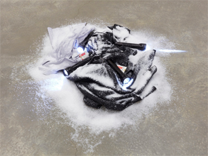
Gillick has adapted Judd before as well, while paring back the visual pleasures. Stacks of powder-coated aluminum, with Judd's bright colors and raised edges, never stand half as large and as free. His latest Plexiglas tower adapts Judd's forms and materials, but without the veils of color. Now, too, he doubles down on the resemblance to furniture. A wood-toned box could serve as a crib for a stubborn child and a dark circle on the wall as a bedroom mirror. What could pass for a bean-bag sofa has no room for you.
A critic as well as an artist, Gillick speaks of "the semiotics of the built world," meaning design and architecture as signs and symbols. If that makes them also something to decipher, consider this a test that you are sure to fail. Adjacent works could serve as a black bench and large dining table, if only you were allowed to sit and the table were more than a few inches off the floor. The artist leaves two of his books open on the table's center, daring you to get anywhere near close enough to read. Another book lies open beneath still another glaring light, this one descending all but to the floor, and one last occupies the sofa. Lean over if you like, but do not ask to turn the pages.
Gillick nudges Minimalism into the built world because it was there all along. Both art and design, he implies, are in the service of consumer culture. Late modern art and the makeshift furnishings of an artist's studio may lack for luxury, but they make up for it by influencing design trends. They may also play into the hands of gentrification. This particular gallery left Chelsea five years ago for what people used to call the flower district a few blocks east. Now it is NoMad.
Ruthless as he may be, he has a design sense that many would envy. The dark circle works as a black painting, maybe after Stella, while mirroring the art and the room. A cut into the tabletop brings it that much closer to abstraction. The long cords of that lowest of light fixtures ripple against the wall, like brush marks on a minimal canvas. Two more spotlights have blue plastic sheets in front of them, like Judd's Plexiglas color stains after all. Just as for Judd, you can look on the ordinary gallery fixtures as part of the show.
Gillick also has a narrative sense, theory aside, if a cryptic one. A black jacket lies crumpled on the floor topped with flashlights, cigarette packages, and artificial snow. That arctic expedition sure went awry. The sofa has more cigarette packages and two liquor bottles, as further rebukes to a coastal culture bubble. Two other works low to the ground contain glass vases, half filled with a dark liquid. It can be hard to pin down their depths. A rather self-certain artist has a gift for uncertain endings.

Jean Dubuffet ran at Pace through October 24, 2020, Bosco Sodi at Paul Kasmin through November 12, and Liam Gillick at Casey Kaplan through April 18. A related article looks at Dubuffet's Art Brut.
