From Improvisation to System
John Haberin New York City
Josef Albers, Sharon Lockhart, and Noa Eshkol
"All the problems are solved. Nothing remains but the execution."
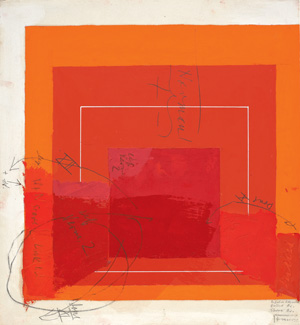
Only Josef Albers could sound half so indifferent and half so controlling. When he called his best-known series Homage to the Square, he could have been paying homage to himself. On paper he has neither the polish of a presentation drawing nor a clear path to completion, for that would come later, on Masonite. Even so, his sheets do not lack for direction, and they never let go. He filled them with pencil annotations, from dimensions to color names, some legible only to himself. When he sent one to the printer, he kept half, so that he could check it against proof later. 
The Morgan Library speaks of "Josef Albers in America: Painting on Paper," because he is always painting. He worked on blotting paper, for the thick opacity of its support. When his pencil went beyond words, it altered textures and colors rather than outlines. He preferred a palette knife, because he distrusted anything as personal as brushwork. If any paint remains on the knife, it may land as a daub on the most central square, just to see the results.
"What interests me most now," he added, "is how colors change one another according to the proportions and quantities." Yet his connections between color and form, art and design, and improvisation and system could stand for the ideals of a late Modern generation. That includes Noa Eshkol at the Jewish Museum, but it is never simple for one generation to see another whole. Maybe that is why the museum sees her through the eyes of dance, textiles, video, abstraction, the human form, and Sharon Lockhart.
Everything but the execution
More than fifteen years earlier, the Guggenheim gave Josef Albers a small side gallery for what it termed "Glass, Color, and Light." Like most people, I knew him from that seemingly interminable series called Homage to the Square. These easel paintings create a sense of depth from small, nearly concentric squares. They helped the art public grow accustomed to the rigors of geometric abstraction, from Frank Stella and others. However, their strong central axis and scientific pretensions come squarely out of early Modernism. So do their decorative aura and love of illusion, like art deco with a slide rule.
Like much early American Modernism, they care little for the late-modern disdain of "mere decoration." And they fit perfectly into Frank Lloyd Wright architecture, not to mention Wright's oddly backward-looking Modernism. Albers really did know his craft, and he understood the implications of decorative arts. I could see his transparencies in light of Wright's more heavily patterned stained glass. I could never see his squares as bad Stellas again.
His relentless pursuit of colors, proportions, and quantities could make him old-fashioned. For all his relevance to Minimalism and color in the 1960s, he still nurtured illusion and the handmade. He had taught at the Bauhaus for over a decade, with a specialty in stained glass, before fleeing the Nazis in 1993—and he was over sixty in 1949, when he began the project that consumed his last quarter century, until his death in 1976. Here he nested three or four squares, with successively lower centers. It preserves a degree of flatness, by avoiding tunneling, while suggesting perspective rather than symmetry. He took paint straight from the tube, rarely mixing, and yet he wanted not art as color chart, but rather to make "colors lose their identity and become unrecognizable."
It also made him a great teacher, first at Black Mountain College, where his students included Robert Rauschenberg. He was not really paying homage to the square, he said later. "It's only the dish I serve my craziness about color in." He could be the last artist one remembers as crazy, but he had guided a college known for its craziness, from Willem de Kooning to John Cage and Buckminster Fuller. He then became chair at Yale from 1950 to 1958—and author of Interaction of Color in 1963. He also worked assiduously, leaving two thousand variations of the squares alone.
They began in black, white, and gray, but even then he called them color studies, because to him they were. The Morgan has fifty examples, including the very first on Masonite—the sole work not from either the Josef Albers Museum in Germany or the Albers Foundation in Connecticut. (The show originated with the Albers Museum and the Staatliche Graphische Sammlung.) Earlier black-and-white studies have an obvious concern for illusion, in a zigzag of squares pointing left and right, like a disassembled Necker cube. The earliest even depicts a garden court, with square flooring. A 1947 sabbatical in New Mexico leads to the more frontal Variant / Adobe series in color, surprisingly like the paintings of his wife, Anni.
Isabelle Dervaux of the Morgan claims a basis in pre-Columbian architecture and archaeology. Maybe, or maybe he had found a way to sever art from all that. He might dab a bar at top, while placing the same color as a square below, in this way building and revealing the study's spectrum. He might try a different shade for a square's left and right halves, and one can picture him blocking each in turn with his hand. Once in his last year, a white line divides a field, to see how that alters perception above and below. He compared himself to a cook, but do not go to Albers for the warm theater of an open kitchen. He had found his laboratory, with controlled experiments, and no one else has paid such homage to control.
Dance of the 7 + 2 veils
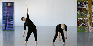
For a moment, Noa Eshkol might have transformed the Jewish Museum into a theater it had never seen. Its main exhibition space, which for Eva Hesse or Edouard Vuillard wound its way through close quarters and intimate objects, for once stands undivided. Through the glass doors, as one approaches on the ground floor, it seems larger still, and the dancers within seem alive. Within, facing the five projections on two walls, there is no sustaining the illusion, but there is no denying either its simplicity and power. Between two and four dancers move slowly in not terribly tight black tights, against a backdrop of bare walls and Eshkol's own tapestries, neither altogether in unison nor altogether alone. The Israeli artist seems to have choreographed and silenced the everyday.
 In a way, she believed she had. She and Avraham Wachman, a professor of architecture, developed the Eshkol-Wachman movement notation for dance, which claimed to derive from the study of routine movements. Yet it also abstracts away the everyday, just as the five short dances do not tell stories—preferring, the museum explains, "to express the spatial relationships between parts of the body." On paper, one can see hints of everything from musical notation to Fernand Léger's Ballet Mécanique. Cones extend outward from near stick figures. Lattice-like spheres at the limit of fragmentary shadows define still more open volumes and solid forms.
Sharon Lockhart discovered those spheres after Eshkol's death in 2007, in her early eighties. In Lockhart's photographs, they seem not schematic but painterly, down to the natural light reflecting off them. I mistook them for artful highlights in pen and ink. It is thanks to the LA artist, too, that she can seem to have transformed the museum today. Five Dances and Nine Wall Carpets by Noa Eshkol offers a picture of a career, with sketches and notations in a room to the side. More photographs of the spheres reside upstairs, along with two more carpets, this time in person.
Do those tapestries end up out of place in the dance, less a stage set when none was needed than an unsuccessful intrusion? Unlike Tiona Nekkia McClodden with Dance Black America, Eshkol thought of her art and dance as separate endeavors, but the projections now bring them together, as for Martha Friedman, as one extended work. If Lockhart is wrong to treat them together as a magnum opus, she is surely right to see them together as Eshkol's art. Both have their roots in Modernism's aspirations at once to systems and to simplicity—and to expertise and populism in design and art. The mix of textiles, craft, and system would make perfect sense to Josef and Anni Albers, not to mention Rosemarie Trockel, Charles LeDray, Angelika Schori, or Al Loving. The carpets alone offer a miniature history of modern painting, including a quilt in mute colors out of Paul Klee, mirrored geometries out of Synchromism or Joseph Stella, patterns like leaves out of Lee Krasner and Krasner in collage, torn fabric out of Kurt Schwitters, a head and arm out of Constantin Brancusi or a Matisse cutout, and deep blues out of Henri Matisse.
Lockhart has a history of artlessness, in photography and video. She has let children and workers pose themselves, while she uses backgrounds or a tracking shot to weave them together as a promise of community. The artlessness relates to the studied confrontations in Catherine Opie and others, but the promise and the community do not. She must like that the movement notation has applications in physical therapy as well as dance. The film also contrasts interestingly with recent videos by Alix Pearlstein. Pearlstein's dance insists on white clothing and heads held aloof in classical profiles, not to mention a politically correct mix of races and genders.
Eshkol refuses perfection and purity in everything but the system. She still might not quite make sense of this illusion of collaboration. With just the two carpets upstairs, laid on pedestals at ankle level, it almost stops just short of an exhibition as well. On film, the "wall carpets" actually stand apart from the walls, as something between punctuation, partitions, and Murphy beds for singles. Stephanie Barron and Britt Salvesen of LACMA, Talia Amar of the Israel Museum, and Aviva Weintraub of the Jewish Museum can still take credit for pulling all this together. And Lockhart deserves credit for sharing her discovery, one that brings a welcome humanity and artifice to her own work as well.

"Josef Albers in America: Painting on Paper" ran at The Morgan Library through October 14, 2012, and "Josef Albers: Glass, Color, and Light " at The Solomon R. Guggenheim Museum through September 17, 1995. "Sharon Lockhart | Noa Eshkol" ran at the Jewish Museum through March 24, 2013, Alix Pearlstein at On Stellar Rays through October 21, 2012.


