Lord Graystroke
John Haberin New York City
Jasper Johns in Gray
The Cold War did not do nuance, and Jasper Johns appropriated at least two of its symbols. His breakthrough came in 1954, when he began painting an American flag. He also began the 1960s by mapping the continental United States. I do not even count the overlaid numbers from 0 to 9, like the test patterns on early television—or a countdown to disaster.
Perhaps the Cold War could not accept shades of gray, but Johns has outlived all sorts of provocations and assumptions. Now the Met has the temerity to restrict an exhibition to his work in gray, and he looks more provocative than ever. It may sound like a mere postscript to modern painting. Yet the curators, James Rondeau and Douglas Druick, do not intend a quiet study alcove. "Jasper Johns: Gray" covers fifty years, starting soon after the young artist destroyed all that he had painted and started over. It dares one to see Johns differently, but also to figure out whether he does look different in monochrome. 
In the process, it poses again the enigmas that have made Johns so formidable. Probably no one can keep track of them all—image and object, signs and what they signify, copy and original, public symbols and an artist's private language. If a painter is going to hide in plain sight, it helps to cover seeing in layers of gray. A postscript three years later looks at Johns past eighty, returning to the numerals in silver, aluminum, and bronze.
Black and white and red all over
Jasper Johns has said that he occasionally cannot distinguish colors, but he made his mark as a colorist, starting with the good old Red, White, and Blue. In his maps color runs riot across state lines. In some versions, broad horizontal stripes of red, yellow, and blue pour into the Atlantic Ocean. His Green Target shoves another discordant color in one's face. Even with White Flag, white comes across as a surfeit of brightness. When the right outlaws flag desecration, museums had better fear for their lives.
Color, however, comes with some severe restrictions. If one surfs the Web for Johns, one turns up first a flag, a map, and False Start—another riot of primary and secondary colors. The careful, individual brushstrokes in False Start add up to splashes of color, with the names of the colors in stencil letters. In the 1970s, as younger artists struggled with the legacy of geometric abstraction, he took up his Crosshatch series in the same color set. Once again color serves Johns as a found image or object, much like a flag, a map, numbers, or the alphabet.
Color here seems to eradicate nuance. When Johns paints the stars and stripes over newsprint on plywood, he is adding texture, but also the curt, bold immediacy of the headlines—or a bad joke. What is black and white and red all over? His very embrace of encaustic has to do with his impatience, with art and perhaps with the viewer. Many artists find encaustic too difficult to control, because it dries so fast. Not even acrylics dry quickly enough for this artist's brushwork.
So, at any rate, goes one side of the story. Work on that flag actually spanned two years, and it took both encaustic and oil—a medium demanding control because it dries so slowly. Paint also makes the headlines illegible. Perhaps he used The New York Times, the "gray lady." More famously, the text in False Start mostly misnames the dazzling color fields, although not even that pattern is consistent. Cleverly, the Met opens a show of gray with it, giving an old title new significance.
To complicate matters still further, a word in English always refers to what it names, regardless of its typeface or color. Johns could be insisting on a contradiction—or on two kinds of literal fact. He could be announcing the breakdown of art and a loss of words, or he could be asking a viewer to acknowledge meaning as shades of gray. The word GRAY itself turns up, but not the color. Look at the painting long enough, and there it is among the other false starts.
False Start hangs, logically enough, outside the show's entrance. It also hangs next to Jubilee, which more or less replicates the entire work—in almost exactly the same dimensions but in gray. Jubilee makes perfect sense alone, as a less aggressive but even more beautiful painting, with all the same dilemmas. It also has one matching up fields from painting to painting, extending the puzzle of an exact copy after art or nature. Johns can think in color or in gray, but never in black and white.
Gray as medium and color
Judging by the first room, he has been thinking in gray for some time. Just when Jubilee has set one up to expect copies of Johns's greatest hits, the show proper takes one back to 1957. The first room has a consistent plainness, as if had not quite settled on an image or subject. He had not yet had his first show at Leo Castelli, thanks in no small part to Ileana Sonnabend. One can imagine him in his twenties, trying to get the hang of encaustic. He can always mix in more pigment later, right?
Several works incorporate studio parts, such as wooden knobs, canvas folded over itself in one corner, or the back of a stretcher. He may cut a rectangle into the canvas, then return the pieces just where they were. The knobs convert such pieces into drawers that one can never open. Robert Rauschenberg, too, was then occupied with assemblage—his Combines, which the Met surveyed in the same galleries two years before. Both artists turn again to painted imagery around 1960. However, Johns is painting all along, and his disruptions lie within or upon the surface even more than for Rauschenberg's Bed.
Of course, he is playing with the critical vocabulary of the time: abstract painting had to assert its flatness, its nature as an object, its process of coming to be, and the shallow space in which all that plays out. Just when criticism outlawed illustration in favor of the literal, Johns illustrated the literal. In turn, the attribution of space to a painting now became literally true. It also became literally false, since no chest of drawers exists, and nothing would lie inside if one could pull them out. The folds challenge one to define where a painting begins and ends.
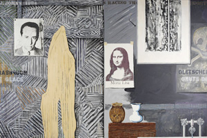
That remarkable sense of facture and facticity persists throughout the show, as a hallmark of Johns in gray. Later, he uses gray for portraits of his studio. Fool's House has a teacup hanging from the bottom edge, another stretcher, and a broom within the painted area, where it has swept out an arc. Here the text labels each item correctly, since this is, after all, real life. Elsewhere sticks and rulers rest at the point of their traces, and the recent Johns Catenary series takes its name from the shape of a string that hangs under the influence solely of its own weight. One can describe these as incorporating the artist's gestures—or as excluding him in favor of painting that makes itself.
Gray also appears as the medium of sculpture or of prints. One sees just how many media Johns has explored and his fascination with technique. In lithographs, Johns accentuates rather than hides how the medium works—as a greased stone repels ink. In fact, he likes it so much that he applies ink to plastic, so that small puddles form around the edges of an image. His room at the Philadelphia Museum of Art has always offered a tribute to gray, thanks to painted bronze and Sculptmetal, the plumber's aid. Eva Hesse used it, too, to make sculpture flow like painting.
As yet another miracle, the virtuosity in gray extends to color. Sometimes color returns explicitly, because the artist has painted over it, effacing it without quite eradicating it. The pigment heightens the natural scattering of light off gray, and it can form shimmering shadows around the edge of a gray area. Johns says that his Flagstone series began with the glimpse of stone on a New York street. However, he got there through the Crosshatch series, works broken into irregular segments, each segment composed of parallel color strokes. Over time, the segments themselves become an independent subject, like tiling.
Somber artistry
When Johns works in gray, image becomes an object, more even than with Three Flags. Work in gray insists on the given, by recycling old themes, just as with Jubilee. However, it also demands attention to detail. Shades of gray just cannot help allowing nuance. One can see why Brice Marden dubbed an encaustic of his own Three Deliberate Grays for Jasper Johns. Among Johns's other puzzles, one sees only the given, but the more one looks the more one sees.
Modernism culminated in two parallel channels, formalism and appropriation—art as a universe to itself and art as indistinguishable from "real things." The first corresponds to what Nelson Goodman, the philosopher, called languages of art. The second corresponds to what Arthur C. Danto, with his hypothetical artworks and love of Andy Warhol, called art after the end of art. Like Gerhard Richter, however, Johns makes conceptual art and painting impossible to disentangle. In gray, he lingers that much more over the somber artistry.
The show combines a thematic and a chronological arrangement, with separate rooms for such subjects as numbers and letters, but roughly following stages in Johns's work. He makes that compromise possible, thanks to his frequent self-invention. He moves among prints and other "lesser" media, but one can hardly worry too much about which to deride as a copy, since he did not invent the image anyway. Each alike represents a flag, map, target, number, or letter—and each is a flag, map, target, number, or letter. In the course of his endless recycling, too, found objects become an artist's personal vocabulary. "Jasper Johns: Gray" insists on his critique of originality, but also on his critique of the copy.
For better or worse, the thematic arrangement makes Johns less detached and more accessible. His MoMA retrospective in 1996 gave more space to abstract paintings from the 1970s. The Catenary series still lay in the future. In between, a return to representation and to what Johns called Racing Thoughts was still new and even more mysterious. What was one to make of the artist's bathtub, his corpse-like shadow, a photo of Castelli pinned to the wall, the outlines of sleeping soldiers from a startling Renaissance Crucifixion by Matthias Grünewald, stock optical illusions, and goodness knows what else? With a room to each subject, the show assimilates everything to the artist's growth.
However, gray cannot shed its darkness either. Besides, after ten years it has become easier to see the darkness all along. One can follow references to the death of Hart Crane, the poet, from recent work back to Periscope in 1963 or the first Diver in 1962. Tantric skulls interrupt an abstraction. Racing Thoughts includes a warning in French—about either falling ice or a broken mirror—and each disruption of symmetry seems to foretell a near-fatal accident. One can imagine an older man's sagging features in that bathtub. As early as 1957, Rondeau observes, the folded canvas may suggest a more clinical bed than Rauschenberg's, with the sleeper or a lover sadly absent.
As one last puzzle, one could call Johns's repetition a dogged determination in the face of death, Freud's "repetition compulsion," the fate of art, or sheer joy. A found object may veer close to confession, but the confession never comes. As Barbara Rose notes in the catalog, Frank Stella pairs two of his own mitered mazes, one in color and one in gray. Stella calls it Jasper's Dilemma, but Johns in gray may no longer force a choice. As in False Start, both color and gray have been hiding in plain sight all along.
A postscript: all the news that fits
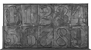
It says something that the centerpiece for Jasper Johns in 2011 stands off center. Perhaps one should focus instead on the silvery pressed metal covering an enormous central partition, with fourteen rows of the digits from 0 to 9. But from a distance it looks almost a mirror, and it could almost have come off an assembly line a moment before. Besides, just try to get past the smaller reliefs, to either side along the way. They seem so much weightier, in bronze, aluminum, or silver. Besides, one wants to get up close to each side to read them.
 It is not easy reading. Each shares its ten numerals, five to a row, with fragments of news clippings, as in early Cubism—but denser and, as one would expect from Johns in gray, more obscure. One probably says something about Vincent van Gogh or another tragedy, but what? Or maybe they just say something about Johns, who all but owns the patent on the numbers since his Sculptmetal of 1964. Johns always has a way of keeping one off balance and off center, and dispersal is very much part of the story. Best to move on.
Dispersal is certainly the story of printing. Each relief is a single sheet, but its units recall the metal type of an old press. They fit neatly into supporting slots to either side, as in some actual heavy machinery left for scrap, and the patina only adds to their sense of weight and age. To confuse things further, a press must once have printed each news item, which then becomes part of the sculpture. The work might have created itself, half a dozen times at that. All the news that fits we print.
It is a cliché to add that none of this would matter if it were not so beautiful, but it matters that for Johns it is true. It is certainly not true for any number of examples of text art, from Lawrence Weiner to Glenn Ligon, which does not make them heartless or glib—although it does somehow make John Baldessari part of Southern California. Johns, though, still takes care. The reliefs preserve painterly gestures in wax, even as the imagery denies anything in the least personal. Looking back, it gets hard to pin down precisely when the found imagery became so thoroughly his. Or when it spins out of his control.
After several routine shows, Johns has plenty of top-spin. The reliefs on their narrow pedestals look more like paintings than sculpture, only unable to hang on the wall. Actual prints here look routine by comparison, because they are, but also revealing of what is going on all along. They, too, recycle motifs that he has made his own. Perhaps for that reason, they avoid his crosshatching or anything that might fall as it may. They stick to the young woman that seen differently becomes a hag, the vase that outlines a face, and the rest of his old optical trickery.
Then they layer them on, because two ways of seeing are not enough. A career is at stake. The found imagery carries marks of the body, and not just in depicted faces. Like the reliefs, they incorporate signs of the artist's hand, including literal hand prints, as something between signature, texture, physical injury, accident or mistake. If Rauschenberg in his last decades was all too gregarious, Johns is still hermetic, engaged, and both at once. The repetition, the tension between statuary and transience, or even the detachment may be ultimately about him at age eight-one—which is no small part of their beauty.

"Jasper Johns: Gray" ran at The Metropolitan Museum of Art through May 4, 2008, and at Matthew Marks through July 1, 2011. A previous review attempted to grapple with the artist's dilemmas on the occasion of Johns's "Catenary" paintings, and a later review turns to Johns in retrospective.


