Before the Rectangle
John Haberin New York City
Mark Rothko in 1949 and Dark Palette
How do you get to the Rothko Chapel? Practice, practice, practice.
Pace traces Mark Rothko's progress in a critical year—for the artist and for modern art. Starting in late 1948, Rothko came to see colored rectangles not just as the artifacts of brushwork and compositional elements, but as the composition itself. The twenty works show a painter hard at work on what, in retrospect, may seem a single idea. Yet the process should get one thinking, too. 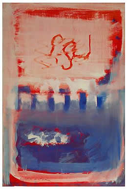
Then again, maybe not. One can see instead an artist who gives up practicing and at last gets on with the job. As he lets go of traditional composition, he seems to let himself go as well. More interesting still, the show casts doubt on avant-garde narratives like self-discovery and the breakthrough of American art. One sees a painter's very style and personality less as a moment of intense discovery than as a carefully developed creation. And that holds out the potential for successive, multiple recreations, right down to that dark chapel. As a postscript, the same gallery picks him up again in his final years, for his dark palette.
Genius, in retrospect
Who wants Carnegie Hall anyway when the real action had moved to a hipper part of town? True, Rothko does not come across as terribly funny either. People sit with his work because it offers a place apart from the one-liners. One imagines a respite from the rapid-fire changes of day-to-day existence—and even from the artist himself.
Rothko shares with Jackson Pollock, Barnett Newman, or Willem de Kooning the signs of his time. One gets the scale, the immersion in oil, the pull to the edge of the canvas and back toward the center, and a personal insignia. Still, a Pollock drip, Newman zip, or de Kooning woman has one dancing with the artist or arguing with the critic. For many a viewer, Rothko's color excludes all that.
Or does it? Those fuzzy rectangles bring out fuzzy superlatives. In his clouded rectangles, one may see a luminous mirror of one's own emotions. Alternatively, one may see only the objects of formalist theory. Either way, one can easily reduce the artist to technician or seer—in short, to the avant-garde genius.
The 1998 Rothko retrospective brought the paintings down to earth. They throw back at the viewer a world right in front of one's face. At the same time, the artist was writing himself out of the picture. Think of that slow but steady progress from urban landscapes to blocks, squiggles, and finally color for its own sake. Eventually, with his suicide, he writes himself out of his own life as well.
Museum blockbusters love big stories like this one. They elevate an artist to a unique, original genius. They set him apart from others and, often, apart from disturbing facts like race, class, and gender. They focus on the creative personality, what a critic has called the "originality of the avant-garde."
Real, messy lives involve multiple rivalries, influences, and attachments. They require self-discoveries and self-creations. Yet that, too, becomes part of the myth of genius. Picasso and Henri Matisse look more creative the more often they change the rules of the game. Retrospectives go along with the story—a story of becoming oneself. Never mind who the artist was before that.
Technical lessons
Pace suggests an alternative: pick one critical year and let it unfold. Before, the gallery has exhibited Rothko's early work. Now it turns to 1949. Without the earlier realism, it cannot fall back on a historic struggle toward abstraction. Without the late years, it cannot escape to formalism and the sublime. It marks instead a transition.
 It cannot even fall back on the usual questions. It cannot ask how an immigrant felt so at home in early American Modernism and urban realism. It cannot ask why he and Adolph Gottlieb, part of a rather conservative group called "the Ten," gave it all up for abstract art. It cannot ask why Rothko then gave up the intense colors and emotional uplift for the darkness of his last years. It cannot offer directions to the Rothko Chapel after all.
What does that leave? It leaves plenty—and maybe the most absorbing show of just twenty paintings that one will ever see.
For one thing, it leaves much-needed technical lessons. The first works often look darker and heavier than they are. They typically start with underpainting, with the color and reflectivity of weathered shellac. A bright blue might sit on top of that, leaving a fair amount exposed. No wonder the blue looks so dark and massive. Besides, nothing interrupts the top layer, and, as the axiom goes, more blue is bluer than blue.
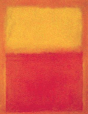
Later works look airier because they work from brighter colors up, sometimes from white to black. They leave more of the texture of canvas, but less of the canvas exposed. They have a lot more layers, which intermix freely. Instead of the progression from canvas to underpainting, fields of color, and finally brushwork, one has a controlled, nuanced color of the artist's creation. The image and ground alike seem to float, because the distinction between them has vanished.
Nowhere to go but up
For the same reasons, the abstractions underscore the continuity in Rothko's career. Those first, clumsy masses recall his brooding early realism and his darker late series as well. Even his subway traveler seems far from the heightened realism and anxiety of George Tooker. On the one hand, they help resolve the puzzle of how a depressive produced such joyous color. Conversely, they help explain how airy colors can carry so much weight. Rothko himself said that he wanted them to have the weight of tragedy.
The turgid shapes come as a particular surprise, because the official history leaves so little room for them. You know the story: Abstract Expressionism combines Cubism, which frees art from "anecdotal realism," and Surrealism, which supplies the human element. It combines the scale of public art with the private impulse of drawing. To postmodern critics, it reflects the glib self-confidence of an emerging American empire.
And all that is true. With Rothko, though, one sees anything but impersonality or a confident ego. By 1949, Arshile Gorky had already died, Pollock had begun to drip, and de Kooning had filled a canvas to its edges with the shards of his Excavation. Rothko adapts the saturated canvas, soft textures, and wide-open colors of Gorky and Joan Miró. Yet nothing flows freely.
For months on end, Rothko remains the unsmiling, enterprising student with a lot to learn. Each element sits uncomfortably apart. Where Gorky had such transformative titles as The Liver Is the Cock's Comb, Rothko offers up simply Untitled.
Paradoxically, the bright colors here remain dark, whereas Rothko's black paintings glow with color. In his glory years, starting in late 1949, he represses darkness without erasing it. One overlooks it because he has placed it in plain sight, right on the surface.
The shift toward symmetry brings a comparable gain. Early in 1949, color patches play the role of independent objects, like parts of an urban landscape that has ceased to appear. They have weight. They could fall to the bottom edge at any moment. The later, wider rectangles rule that out: they leave nowhere to go but up. One overlooks that they press outward as well.
Black and white and red all over
When Rothko first paints a horizontal rectangle, he puts brown patterns over it in broad strokes. Even then, he cannot stop trying to leave his mark. To become more personal, he has to try less hard to play great artist or American Surrealist. He has to stop practicing.
Many would contrast Pollock's energy and drawing to Rothko's stasis and color. Pollock learns from innovators like Hans Hofmann, Philip Guston, Janet Sobel, and Lee Krasner. Rothko, in contrast, may seem to leave his feelings on the surface.
The year 1949 puts things differently. Pollock's retrospective already had me seeing his art in two stages. First he moves from realism to an arbitrary vocabulary of pseudo-primitive symbols. At last he attains what Julia Kristeva calls the semiotic, a trust in the play of signs and paint themselves. In the process, the picture plane becomes like a wall, with the artist and viewer together on this side, both part of the space and excluded from it. 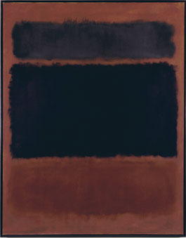
Rothko's discovery of a not-so-flat flatness has a lot in common with Pollock's. He, too, starts doodling in signs, only to abandon them for the scale and texture of a mural. As he relies less on design and composition, he takes more seriously than ever the old metaphor of painting as mirror or window onto nature. Only now the mirror is clouded over. Now the window refracts more than it transmits or reflects. The old idea of the artist on one side and the viewer on the other goes out the window.
Like Pollock, too, Rothko in his last years comes close to working in black and white. In this exhibition, however, nothing is really black and white. I left thinking how much texture and drawing finally merged in the rectangles. I left recalling how much of the rainbow lies in the recovery of black. The nice thing about a painter's progress is that art has so little to do with progress. The nice thing about a critical year is that the rest of a life never quite looks the same.
A postscript: beware of darkness
Thirteen years later, the gallery picks up Rothko at his darkest, but there, too, nothing is really black and white. "Dark Palette" achieves a blockbuster with just twenty paintings, drawing on museums, private collectors, and the artist's family and estate. So long after his New York retrospective, is there anything left to learn? Maybe not—not from painting all about looking without insisting on seeing oneself or him. The organizers go so far as to dismiss reducing the late paintings to his failing health, failing marriage, darkening mood, and coming suicide. They do, after all, begin a good twelve years before his death in 1970.
Perhaps, although I would have to forget the joy of his brighter colors along with the deeper elation of the darkness, so obvious an influence on Yun Hyong-keun in Korea. More to the point, the show goes beyond black and white with its sheer variety. When you think of Rothko, do you think of something like a formula, with two rectangles against a fixed color, on a canvas two or three times as tall as it is wide? So what happens when he turns from the long horizontal of his unfinished mural for the Seagram Building to an unexpected tall, narrow vertical? What happens when he adopts a single rectangle, three rectangles, or slim dividers—or, like Ad Reinhardt, black on black? He keeps experimenting, but without the idea of progress toward a given endpoint.
One can linger over his technique—canvas stained with pigment and binder, then overlaid by thin layers of oil or, occasionally, acrylic. The layers may seem to merge with the underlying color or add up to a thicker slab of black. Most often, a dark tone overlays a more richly colored field, in Rothko's familiar dark red or purple. At least once, though, the topmost layers run to loose brushwork and an electric blue. Do not even ask what comes next, and do not ask whether to call it black or color. Beware of darkness, and look again.

"Mark Rothko: A Painter's Progress, the Year 1949" ran at PaceWildenstein (its midtown gallery) through February 23, 2004, and "Mark Rothko: Dark Palette" at Pace in Chelsea through January 7, 2017. A related review looks at a major Mark Rothko retrospective.
