How to Make Your Head Spin
John Haberin New York City
Bridget Riley and Jacob Samuel
After decades of Op Art, Bridget Riley still makes one's head spin, without harmful side-effects. She does it in retrospective at Dia, and she does it again twenty years later in drawings from her collection at the Morgan Library. 
Gabriel Orozco will show you art in a handful of dust. It is a rebuke to traditional art forms all the same, with a little help from Jacob Samuel. Did Riley sum up a style and a movement? Yes, but she did something else again: she gave that style an impact, on painting as well as on the senses, that the movement as a whole never could. Yet Samuel did more than one might expect, too, from an artist of limited ambitions and limited scope. Working solely on paper, his collaborations summed up a time.
Dust is a space, but not a landscape. Orozco makes that clear on the opening page of a series of prints. So what if it, too, is a work of art? Samuel, a printmaker in Santa Monica, has worked with some sixty leading artists over more than thirty years. Many of them would otherwise have refused to enter any space that reeks of fine art. That includes the space of "Jacob Samuel and Contemporary Etching" at MoMA.
Working spaces
One more survivor from color in the 1960s, Bridget Riley got to know the media circus the hard way. It stuck the British artist in the next big thing, Op Art, before passing her by. At last she gets a small retrospective at Dia with its deep commitment to displays of a single artist, plus a strong gallery show of recent work, with a larger show at Tate Britain soon after. Her welcome return could stand for the conundrum of entertainment value in art, but with a thorough commitment to the rigor of abstraction. Riley's marvel is to make those apparent opposites depend on one another.
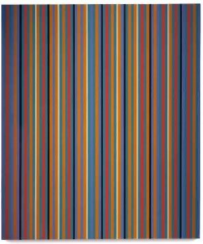
Riley began entirely in black-and-white. In the early 1980s, though, she turned to thin vertical stripes of color. Then came jumbled parallelograms. More recently still, she uses large, curved areas of acid but muted green, blue, yellow, and orange. It is hardly AI-assisted art or digital art, which as yet struggle to explain what makes them novel. Yet she could almost be creating a Lee Krasner by algorithm.
As one walks in, some may look simply boring. Up very close, though, the parallelograms begin to overlap in some imagined larger space, then flutter wildly. The verticals vibrate, while white stripes at regular intervals hold out the faint hope of clarity. The blandest, the curves, just bend slightly, with tantalizing hints of symmetry along the diagonal—symmetry that, as in a Jasper Johns crosshatch painting, never comes to be. Nor do the effects go away once one steps back, and I treasure that strangeness. It may be entertaining, but it is not pandering one bit.
Riley insists on careful, handmade work, an influence on Rob de Oude today, but with razor-sharp edges that back off from an artist's presence. Like Frank Stella, she began with iconic black paintings. Like him, she now sticks to geometry and flat areas of color to bring out their relation to the picture plane, all the while thrusting viewers into other spaces. Like him, too, she comes from the discovery back in the 1950s of big pictures, with the juxtaposition of two scales of experience. From afar, art is art, an object of serious contemplation. Up close, it is something more human, if not downright funky.
Riley could well be fulfilling Stella's Harvard lectures on art, Working Space. Like him or Nancy Rubins, she increasingly offers bland but serious fun. Conservatives go on long screeds about the decline in values. They ignore the part that their very values play in the mess. Dealers, after all, act out the alleged free market, and museums pander simultaneously to wealthy donors and a collector's choice. Meanwhile, the attack dances past the way art does survive, with work that grips viewers and elicits a challenge or a smile.
Painters these days offer less an art world than a pageant. With no one big thing, they just get to try lots of little things. And some shows do cave in and settle for the smile. Still, like Riley, the best know when to focus on the challenge and the smile. They know how to turn them on all the more brightly when serious issues come up, even if that smile is still giving me the highway blues. It may be only an illusion, but that, after all, is her art.
Step by step
How, then, does Op Art make one's head spin even now? It takes stepping back and taking pains. Riley says as much at the Morgan: "holding myself at a certain distance enables me to be more engaged, not less." And, she adds, stepping back puts her in the place of the viewer, for the viewer, too, is part of the work. After all, where in the world is that sensation or illusion, if not in one's spinning head?
So it is, at least, on the surface, and few artists are half as concerned for surfaces—and how they give rise to the sensation of light and mass. Born in 1931, she had a duly academic education at Goldsmiths, where she "drew day and night," with little regard for the latest thing. She sketched The Raising of Lazarus, not after any particular Renaissance painting I can name, but fascinated by the dark solidity of bodies and a tomb. She drew heads, with serious skill and attention, and a house in the style of Pointillism and Georges Seurat. Even there, color is subordinate to light and mass. It would be years after her turn to abstraction before color again entered her art.
She had to step back, too, because engagement for her demanded a patient objectivity. Her drawings rarely have the impact of her paintings, and few have exhibited before. The Morgan's selection comes entirely from her, and that, too, makes sense, because painting for her came about painstakingly, step by step, and the first step took place in her studio. Often she annotates a drawing, with what read like to-do lists. She had to discover the hard way what comes next. Like Seurat but without his care for middle-class society or his shimmer, she had to discover how light can emerge from line.
Ever the student and the observer, she had to train herself to look. The show charts her progress from stripes to parallelograms to curves, much like Riley's retrospectives in 2001 and 2003. Yet it tapers off as early as 1985 and pretty much cuts off with the new century. It is more about her coming to be. One can number the discoveries that went into her art in little more than decade, staring in 1964. Who knew that Pop Art's illusion could take so many steps?
She set realism aside at last in 1961, with fields of black akin to fields of color for Ellsworth Kelly. They seem to take on mass as they reach out toward one another as if to touch, in The Kiss. Soon enough come curves, nested circles, and smaller repeated elements. She wants to see how unseen shapes can emerge from the grid. Sometimes she works on lined paper, as if to rein in the free play of unpredictable curves. It will take another thirty years before compositions became that irregular once and for all.
Color appears in 1967, although even then she backs off for a bit. She cares more for how slight variations in spacing and direction can set static shapes in motion and into the light. Could that be what defines Op Art after all, not undulating color? The Beatles back then were going psychedelic, and the parallel is unmistakable. Still, this is not your mind on drugs. This is your mind on abstract art.
The first dizzying vision appears in 1974, and her trip without tripping is complete. Riley takes up collage around 2000, but then she was not the first artist approaching seventy to needs resources other than her hand and a brush. Think of Matisse cutouts. This may be her first show of drawings, curated by Rachel Federman of the Morgan, Cynthia Burlingham of the Hammer Museum, and Jay A. Clark of the Art Institute of Chicago. Not that she has lacked for exhibitions, and not much is new. Still, one can learn when to step back.
A handful of dust
What kind of print is right for modern and contemporary art? It could be lithographs for their relative ease of making—and for a poster style going back to Henri de Toulouse-Lautrec. It could be silkscreens, for the world after Andy Warhol,  or monoprints, where anything goes. For Max Beckmann and German Expressionism, it could be woodcuts, with thick, jagged outlines that speak of a crude past and a still harsher modern world. But no, for Jacob Samuel favors a medium as disciplined as etching. He took it up in the late 1980s in the studio of Sam Francis, the abstract painter, and has been seeking collaborators ever since.
In etching, the artist makes incisions, akin to freehand drawing, in a protective layer over a metal plate. An acid batch then penetrates the incisions, leaving its cuts in the plate. Wipe away the protective layer, brush ink over the plate, wash away all but what has found its way into the cuts, press the plate against paper, run them through a printing press, and (voilà) you have an etching. Each of Samuel's collaborations led to an entire series of prints, and many have entered the museum's collection. It has been a learning experience for everyone, and he likes it that way, even if the artist gets the credit. It takes both parties out of their comfort zone.
The curators, Esther Adler and Margarita Lizcano Hernandez, open a modest show with a display case for portfolios, with elegant, intriguing covers tailored to the artist. They close with two walls for sample prints from many more. In between, they focus on series from a single artist—with the added interest that prints, however ephemeral, can come in multiples, as series of series. That includes series of series of dust. Samuel favors series in a single tone, and several artists favor limited tones within a single work as well. For John McElheny, that means an elusive white on white.
A video shows instruction from Francis himself, who pronounces himself indifferent to whether the work will sell. He wants only to try things—like his big splashes of primary colors. That must have been a daunting message for an aspiring printer with a career in mind, but if Samuel had reservations, he keeps them to himself. It certainly prepares him for some difficult artists. I never could decipher McElheny's white text or decide whether his minimal forms represent champagne flutes. I am still searching for signs of a notorious social butterfly, Harry Crosby, in prints by Charline von Heyl, such as slippers and a silk scarf.
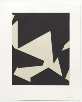
The artists had to learn something beside printing technique. Christopher Wool, known for his word paintings, says that it helped him find his way to drawing again. James Welling, known as a photographer, instead assembles quadrilaterals into larger shapes, starting with paper scraps and software. Samuel had to learn far more. How was he to transform dust into incisions with Gabriel Orozco—or, with Mona Hatoum and Matthew Monahan, masking tape and human hair? Jannis Kounellis keeps piling on the challenges, with molten lead, smashed glass, coffee grounds, and more.
They enlarged his view of prints as well, beyond etchings. They took him to aquatints with Dave Muller and to drypoint with Barry McGee (while Kounellis used both). They had professional needs, like dance notation for Meredith Monk,and personal ones, like Marina Abramovic making (she hopes) love potions, Chris Burden in the wilds with knives, and Muller sharing home turf with bears and dragonflies. They all had to learn new questions for art. How much line, how much texture, and how much text? The contemporary etching wants to know.

Bridget Riley's retrospective, "Reconnaissance," ran through June 17, 2001, at The Dia Center for the Arts, her "Recent Editions" at PaceWildenstein through October 21, 2000, and drawings from her collection at The Morgan Library through October 8, 2023. "Jacob Samuel and Contemporary Etching" ran at The Museum of Modern Art through March 23, 2024. A related review, a tour of London galleries and museums, stops for Riley at the Tate.


