Abstraction as Real Estate
John Haberin New York City
Ayn Choi, Kellyann Burns, and Robert Moskowitz
Rannva Kunoy and Jacqueline Humphries
Now that painting is back from the dead, will New Yorkers go anywhere to see it live? Ayn Choi explores the promise of abstraction and real estate far to the west of midtown. Can that market kill painting once again? Generations apart, she, Kellyann Burns, and Robert Moskowitz are still finding possibilities in the space around gesture and Minimalism. So are Rannva Kunoy and Jacqueline Humphries with sign systems and color fields. In case you were wondering, Moskowitz even tosses in a skyscraper.
The walk to wealth
New Yorkers have every right to say that they will go anywhere for art, including a healthy schlepp from the nearest subway. Fort Tilden, past Rockaway Beach? I made it last summer for a house built on sand, drenched in paint by Katharina Grosse—and even more for the walk and the view. 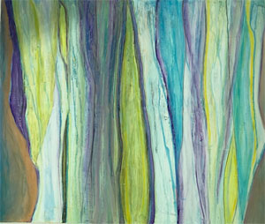 Ridgewood past the edge of Bushwick, Red Hook by the Brooklyn waterfront, Wave Hill in the Bronx, or the Queens Museum in Flushing Meadow Park? Well, every so often, and the last of those has a scale model of the rest of the city to make me feel at home. But far west 42nd Street?
It is only Manhattan, not quite within view of Times Square or the High Line, but not exactly beyond reach of the guide books. It takes longer to reach the piers for the Armory Show or the May art fairs. The walk has me wishing for the station dropped from the subway extension to the Javits convention center and Hudson Yards, but then that whole project serves mostly the wealthy. I made my way last summer for a sculpture by Yayoi Kusama, on a tour of "privately owned public spaces." Now, though, she has neighbors to either side. Sky Art to one side joins a city-wide celebration of John Giorno, while the Atelier to the west gives over its lobby to Ayn Choi.
Is this the next new neighborhood for ambitious art? Like Hudson Yards, it still has more to do with real estate. Sky Art has temporary space in a luxury high rise ("just blocks from world-class theater"), Kusama's not so great bronze pumpkin anchors a private driveway, and that lobby belongs condo apartments as well. Still, the confluence of art and money extends dangerously to galleries and museums as well—explicitly so with a show of the cost of art in the Renaissance. Here at least the grand spaces had me remembering the up side of patronage. Besides, the concentration had me thinking about models for art.
Kusama is always a crowd pleaser masquerading as profundity, while "I ♥ John Giorno" (after the inescapable "I ♥ New York" by Milton Glazer) sounds more like a marketing campaign than a retrospective but recalls a riskier avant-garde. You may know Giorno for sleeping through a film by Andy Warhol. You may know him as a poet, a reader of poetry, the center of a social scene, the partner of Ugo Rondinone, or not at all. Rondinone organized the show, spread among Artists Space, Hunter College, and other nonprofits. Sky Art wraps the walls from floor to ceiling with Giorno's posters, for an overwhelming spectacle of color. They lose interest close enough to read them, except perhaps to his large and jealous circle, but enjoy.
Choi may have one questioning the art scene from quite another angle. She has a fancy lobby, after all. Yet she is hardly an insider, not even with the rebirth of painting. She is just doing her best to make it happen. Abstraction today can have anyone thinking, I saw that one before—and not in the postmodern sense of defying originality. Choi herself can seem all over the map, while enjoying every corner.
The largest work adopts all-over painting, with big splashes of red, yellow, and black framed by a black border that lifts the unstretched canvas off the wall. Others titled Bruised have the fluid stains of color-field painting, in curves running down the canvas amid more slender verticals. Still others resemble what is becoming a dominant style, as with Amy Sillman or Patricia Treib, of irregular shapes in a single color set against softer fields (here in rubbed charcoal) and plenty of white. In my favorite, the top splotches are simply red, yellow, and blue. They refuse premeditation or geometry, share a love of poured paint and layering, and stick resolutely to abstraction. Time will tell if she has left her signature.
Abstraction sharp and flat
Kellyann Burns is capable of warm, clashing colors, but also cagey enough to keep them in reserve. On entering from the Lower East Side, one might see instead a blast from a more austere past, in the person of Brice Marden. While Marden has his bright side, too, 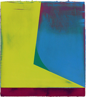 with swirls upon swirls against white, his earlier work seemed to distrust or even to deny pleasure. And Burns adopts his division of the field into two colors, one more muted and yet more sour than the next. They recall his blues and yellows that refuse to stand for primaries—and his gray that infects them all. One panel hints at brightening skies, but mostly buried in black.
Still, they break with Marden's combination of depth and uniformity. Within the same painting, one color is matte and the other shines with reflected light. Both fields are layered, and both lie flat. A line in oil pierces a pale field with the texture of pencil or charcoal. Other paintings run freer, like stains or drips heading the wrong way. Still others allow black to show through, giving colors a touch of smoke.
In truth, Marden was never opposed to pleasure. It just had to be a purely abstract pleasure, without reference to expression or representation. He asks how deeply the eye can penetrate a single field. His later work may identify curves with brushwork, like David Reed, but without Reed's illusion of a wide brush. And Burns is not opposed to Minimalism's material pleasures. The rough edges of her thin panels make one aware of them and the layers of paint that they disclose.
Burns works on Alu-Dibond, or common plastic with aluminum on both sides. The aluminum makes possible the matte or shine—that and the hard work of layering and sanding. A square of wood on the back lifts each panel off the wall and allows it to hang with any orientation. Just as with technique, she is exploring the possibilities. The most colorful and intricate panels are also the smallest, just a little too large to hold in one hand. Their detail and the metal coating bring them that much closer to digital.
Painting so much about craft and versatility can lack that one memorable image. I think how, even after so many years, I recall overcoming my distaste for early Marden. Now in his eighties, Robert Moskowitz still has that image, all the more so because it has to compete with the rectangle. He takes his black and white to the point of abstraction, but without losing that one big thing. The white silhouette of a skyscraper rises at an angle as in amateur photography—or as if soaring into the surrounding darkness. It looks all the more striking if one recognizes the Flatiron or Empire State Building.
Moskowitz's repertoire, from windmills to divers, links him to Michael Hurson and the New Image painting of the 1970s, but it shares the simplicity of the thing itself with Jasper Johns. It began in 1961 with the image or shadow of a window shade, and he is still casting a shadow before interrupting it with light. His latest include two black diagonals that slide against one another just enough that a sliver of white appears between them—and jagged white that boasts of its asymmetry. Either can serve as figure or ground, but then the whole idea of figure and ground has gone out the window. It has gone out, that is, before pulling down the blind. Now just think what might result if Burns retains her breadth while sharpening the flatness.
Mark and gesture
What counts as gestural abstraction? It may depend on what counts as a gesture. Rannva Kunoy and Jacqueline Humphries say that their paintings have nary a one, but like Virginia Jaramillo they leave no end of traces. To complicate matters, the traces show the artists at their most mechanical. They show them, too, at their most deeply immersed in language, and it is not a language intrinsic to art. Yet that very denial of formalism stands as a gesture.
For those coming off the elevator, Kunoy's first painting may seem simple and rule driven. Black verticals reduce it almost to a shade of gray, and then the irregularities appear, along with background colors. Once one sees their purple and green, their shimmer will not go away. Nor, though, will the overlay of acrylic, pigment, and dispersion. One can spend a long time trying to make sense of the letters, numbers, and seemingly random squiggles—or trying to decide where one color ends and the other begins. The paintings are tall but invite one in, in part because their format aligns them with the viewer.
Art has been in this territory before, of uniformity giving way to subtlety or confusion, from Ad Reinhardt and Sol LeWitt to the hybrids of abstraction and representation common enough today. Here, though, the languages of art keep asserting themselves. The acrid colors evoke photographic reproduction, and their staining brings out the texture of canvas. The occasional overlay of white in place of black could serve as photographic negatives of the rest of the show. Yet they also look like ghosts. Abstraction here is haunted by itself. 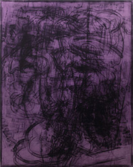
Jacqueline Humphries evokes the glory days of gestural abstraction in her scale alone. The gestures, though, are hers. She says that she has translated past work into ASCII, which may have one hoping for the meaning of her art in alphanumeric sequences that only a browser will recognize. It could even democratize some high-end art. Instead, she uses the familiar array of symbols, from backslashes to plus signs, for gradations of light and dark. She says that she has cut out the bits of black oil with a laser.
She has kept herself out of the process—or out of everything but images, marks, and the very thought of painting as a process. She has a history of silvery surfaces, as in the 2014 Whitney Biennial, much like Kunoy's and just as haunting. Here the ghosts include the raised texture of laser-cut black and what it could possibly mean. (I could swear that signs like shields are cat faces.) They also include underlying brushstrokes laid down as if with a roller, for yet another layering of free and mechanical reproduction. They dare one to decide just where Humphries has entered the picture and whether she has left.
Minimalism and late Modernism did their best to undermine the "originality of the avant-garde," and a subsequent generation pounced on the "death of painting." The brushstroke as a sign helped toward its revival, as with Reed, but critics still complain about "zombie formalism," consigning it once again to the dead. The debate comes down to an opposition between mark and gesture. Could both be present at once? Kunoy and Humphries sure seem to think so. They see expressive possibilities in languages of art.

Ayn Choi ran at the Atelier through January 20, 2018. John Giorno ran at Sky Art through December 31, 2017, Kellyann Burns at McKenzie through November 12, Robert Moskowitz at Kerry Schuss through December 3, Rannva Kunoy at Nathalie Karg through December 3, and Jacqueline Humphries at Greene Naftali through December 16.
